Monday, April 13, 2015

Artist Post

Image result for james white

The artist I chose to research is James White. He was born in 1977 and calls Dartmouth, Nova Scotia, Canada his home.  He began his professional design career in 1998.  His personal projects have gained recognition in the idustry and led him to working with Toyota, Universal Music, MTV, Google, Wired and other clients.  He now mostly works on graphic pieces.
Image result for james white web design
He has a very retro style and likes to use a lot of bright neon colors in his pieces to give his work that 80's sort of feeling to it.  After working with Photoshop and Illustrator I really admire when I see a piece that looks so simply made and flows with the same type of style through out the whole piece.  This one in particular uses all of the lights and dark's to compliment each other and make the style look like almost like a logo that could have been from a company in the 80's. 

 
He really likes to do remakes of old movies and characters that he likes and it can be seen by this blade runner poster that he made. This poster captures everything that he like to focus his pieces on. He likes the 80's style theme and much of his work is using the dark hues, like the dark blue and greys in this piece, contrast with the light bright colors in the piece to make all of subjects stand out.  I'm fascinated by how simplistic all his works look because I know how much work must have gone in to making something like this simple looking poster. I think that after looking through all his works, I want to make a somewhat interactive website that's more art-like and not so much a website that is built for a company. 

Monday, April 6, 2015

Identify Yourself

I really liked this reading on many different levels.  On one level the reading is talking about this ever evolving technology of the internet and how it has made us as people slowly evolve with it is very interesting.  On another level the way that this reading is formatted is a representation on how interactive the internet is.  Every paragraph on the left has a related paragraph on the right which moves down the screen and adjust for each paragraph you're reading on the left hand side.  Also, each paragraph has multiple options to click on a video icon that has a video option to watch something that is related to the paragraph you are reading.  This format of this reading in itself is a representation of how the internet works.  It is literally connecting to you to related information as you are reading through the one article.
The paragraph that stood out to me the most was the one that described "The System." It interested me because I am currently taking an operating systems class and everything that I'm learning in that class makes me think very similarly to the ideas written in the paragraph.  The idea that the "we create machines to compensate for our deficiencies and software to translate our ideas into the language of machines." In my operating systems class were learning about everything that goes into an operating system; how processes, threads, and memory works to make the operating system function.  Every job the computer does is delegated to  certain process or thread.  Within a single process the system can delegate threads to carry out individual jobs to make the process work as efficiently as possible.  The base idea behind every process and thread is to allocate and save memory in the best way to reduce the time it takes for a certain process to function.  All of these ideas of an operating system come from the human mind.  We have made this machine that literally acts like the human mind and can lee track of so many different jobs and hold so much more memory that it has become an extension of our mind, and extension of how we store memories and ideas.
The related paragraph asks the question: "Are we losing the richness of our experiences and memories because we know we can depend on blurry iPhone photos to supplement our memories?" I don't think we are.  I do think that some people go overboard trying to capture that memory but I think that people are just adjusting to the technologies they have.  People want to remember the things that have happened in their lives.  They want to look back and physically see the good times that they have had in their lives.  Its a way of traveling through time.  Sure people are looking through the screen of an i phone during a portion of an experience but that's not what their doing the whole time.  In my opinion we as people have created a way to stop time and record it to be saved and stored in an external memory bank that we ourselves have created.  The experiences you have make up who you are and I feel like physically having an image or video of an experience you've had in the past just justifies who you are as a person.  

Sunday, March 22, 2015

Proj 2 progress

For my project I wanted to turn a picture of my friend wake boarding into a vector type portrait.  I spent a lot of time on just his portrait and to me that was the easiest part because everything was kind of laid out for me for his face and body.  All I had to do was trace over it with the pen tool.  The hardest part for me was trying to figure out how to make the water look simple yet detailed.   The vector artist that I chose (Mel Marcelo) was able to create a style that smoothed out all the details of a person and made them look like they were coming out of a comic book.  It took me a long time and I redid the background like 6 different ways to try and find the right style for the water.  I looked into the different brush strokes and found one that says splash which worked perfectly for the splashes in the water.  I still have to work on the sky and the different gradients in it to make the sunrise more realistic.  It's funny the part that seems to look so simple is actually the most difficult part because it takes so much trial and error to make it fit the right style of the portrait I made.


Monday, March 9, 2015

Artist Post: Mel Marcelo


Mel Marcelo is a digital artist based in San Diego.  He attended the University of California earning a BA in Visual Arts and has lived all over the U.S. and also the Philippines.  He spends time between working on his fine art and working for different magazines and newspapers where he makes images like the ones above and below.  He's had his work in Newsweek, Oakley and a number of other clients in the music and apparel industries.  His style makes many of his pieces look like he turned actual portraits of people and made them look like they could be in a comic book. He uses vibrant colors and is able to contrast all of his lights and darks to make the figure in every image stand out in comparison with the background. Most of his work is done through Illustrator. 


In the piece above he uses the absence of color in Jim Morrison combined with the bright background to make him stand out in the piece.  It's like he is being brought forward to the viewer.  The way that everything is cut off around him (his arms, stomach, and head) makes him the center of attention because he is touching every edge of the piece.  Also, the way Marcelo uses the greys to highlight Morrison's muscle definition is done in a way that seems so simple that it's like he should be out of a comic book.  Marcelo makes the viewer look deep into his pieces because when you first look at them you just think of the person that he has made.  However, at second glance you notice that the entire piece is made mostly of 4 or 5 different shades that add a simplicity to the piece.


I really like this comic book effect that he is able to use.  It reminds me a lot of Shepard Fairey's street art.  He takes images of people that everyone knows and is able to manipulate them and make them into beautiful pieces of art.  The simplicity of each piece is what I like the most.  I know that a lot of work goes into each piece and it takes a serious amount of effort to make all of the layers come together so well that you don't even notice it.  I plan on trying to make a portrait image that copies his style and focuses on the simplicity of characters.  I studied a lot of Shepard Fairey pieces and pieces from Banksy  as well and this style really intrigues me. I hope to make something that is both simplistic and meaningful to the viewer.

music line drawing


5 portraits


Monday, February 23, 2015

Artist Post #3

Pascal Dombis

Image result for pascal dombis antisana
Antisana 
Pascal Dombis is a french a digital artist who has been working on this medium for more than 20 years.  Dombis has been using computers and algorithms to produce excessive repetition of simple process.  By computationally reproducing a geometrical or typographical sign, he creates restructuring structures which develop into irrational environments.  What interested me most when reading the excerpt from class the description of how he made his pieces.  In Antisanna, Dombis uses a recursive process to code the images that are created and then evolved off of the other. In computer science recursion was one of the more complicated things I learned when first learning the language. When I'm coding something recursively there is nothing aesthetically pleasing about writing it at all.  It's usually just taking a input from the user and then using a recursive function to cycle through a function so many times until the function does what the user wants.  Recursion as an art form is fascinating and the abstract pieces that Dombis is able to create seem so simply made and artistic that you would never think about the amount of coding and manipulation of code that goes on beneath the surface of the piece.   
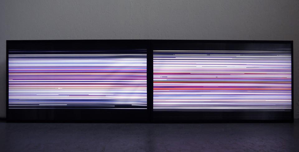
Line_Wave
The part of the reading that drew me in most about Dombis was just the description of recursion as an art and how it is used to model natural phenomena.  If you look at Antisana it looks very symmetrical all of the lines travel around the piece in different layers yet each side seems to be symmetrical and seem to all join at the center of the piece.  This piece gives a perfect visual representation of what the  recursive process is.  In recursion you start off with one simple thing that is given to you.  In a computer scientist terms you start off with whatever data is given to you.  As a digital artist you look at your start point and see how you can evolve it from there.  Once you obtain your data (or start point) you can code it so that function you code can technically go on and evolve into whatever you want it to until you've reached whatever end point you've decided in your function. As a computer scientist recursion can be simple but I can only imagine what it would be like to create an piece of art with recursion.  It would take so much trial and error to make sure each line that you draw in the piece goes the way you want it to and it would take a complete mastery of the recursive process. Coding it would be a very long process to create something that Dombis created.  This article explains that computer art hasn't taken off as an art form and I think the main reason for that is that a majority of the viewers don't see the process behind it. 

  [ENG] CensorZip explores the notion of censorship in China and built a sensational environment that deals with the legibility of images coming from censored web pages. The mass of...
CensorZip

After looking at many of his works online, it seems like every piece he creates has a very digital feel to it.  Some digital artist look towards animating characters or creating life like image in their pieces but all of  his seem very abstract.  However, every one of his pieces make me feel that there is a computer somewhere behind the image.  In Censor zip the rectangular lines and kind of puzzle piece look to it makes me thing of it as like an abstract version of some sort of data chip.  In Line wave it literally looks like a computer screen that isn't working the right way. Even in Antisana all of the lines look like an intricate jumble of wires that make up the piece.  In making all of these subtle relationships to computers and technology he is able to express his process that is not seen by many of his viewers.  That's the part I like the most about his pieces, he brings the medium he works with to life an makes people question how it was made.

Tuesday, February 3, 2015

Artist Post #2


Kazuhiko Nakamura

Automaton

The artist I chose, Kazuhiko Nakamura was born in Hyogo, Japan in 1961.  He was greatly influenced by surrealism and cyberpunk styles of art.  His style of art has dark look to it, non of which really emulate life.  He makes live objects seam dead and mechanical.  In making the lifelike images turn into machines the viewer no longer looks at the piece as something alive.  Once the mechanical aspect transforms the image the viewer is only seeing machines, not live objects. I found this very interesting because of how simply he can transition the mechanical and humanistic aspects of his pieces. He has had exhibitions in Zurich and other places around the world, and has also has had his work used for book and Music CD covers.  I found this interesting because of the upcoming project we have to do.  The object is to combine dissimilar things and my immediate thought was to combine humans and machines.  

Rhinoceros 1515

On the site I looked at about Nakamura there was a quote from an artist reviewer that said, "Nakamusa's art is a surreal hybrid of man and machine, a hard marriage of man and machine, a hard marriage of metal and flesh."  His art does represent the hybrid of man and machine and what it reminded me of is how viewer's feel when looking at something mechanical as opposed to something that's actually alive.  The mechanical element of his pieces give everything a dark ominous mood to them.  He uses very dark hues with many different shades of black and brown to simplify the images.  The lack of color adds to the "dead" feeling of these images.  They all seem to look constrained by the gears and wires that make each figure up.  In Rhinoceros 1525 the mechanical Rhino looks like its being held up and constrained by all of the wires.  In   Automaton the human skull is shown as a layer of the mechanical parts that make up the face.  Nothing seems alive and all of the human like features are only shown in crude bits and pieces.  The only thing that makes it alright to look at is because technically we look at all of the subjects as machines.  

Metamorphosis

I like these pieces for what they represent, and how the artist makes the viewer feel when looking at them. In my opinion I would try to make each piece look more alive and less mechanical.  Nakamura does an incredible job combining man and machine but I don't like how dead every image seems.  Metamorphosis has the most soft feel to it but the lack of color and lack of "humanness" to it makes it seem very dead.  I would add more color and humanistic features to this work if it were up to me. I do think that his work goes to show that once something is mechanical it is viewed at as dead but I don't necessarily agree with that idea.  Anything that is mechanical has been constructed from some basic idea that a person has had.  A machine is an extension of it's makers idea so in a way it's a part of the person who made it. These idea's live on through the machines that we make as humans so in a way machines should be considered living examples the minds of it's maker.  Many machines have the same basic functions that humans do; they have memory, they can die(run out of battery), they can calculate and keep track of time...in a way we could classify as them being somewhat alive. That's why I would try to add a more lifelike feel to these pieces.  


www.mechanicalmirage.com

Editing bad images

Before:

After:


I brightened up the image more so that all of the colors pop out and look more defined.  Before the colors seemed a little bit dull and faded.  The added brightness brings everyone forward from the background a little more than before.

Monday, February 2, 2015

collage


Here's my image collage.  It was hard to get all of the images to  match up together so I made a random collage with a lot of the distorted scanned images.  I used the gradient map a lot to match some of the colors together and messed with the lasso and image transform option to make everything fit together.  I like the piece and it was good practice on how to mess around with photoshop.

Tuesday, January 27, 2015

Text editor image


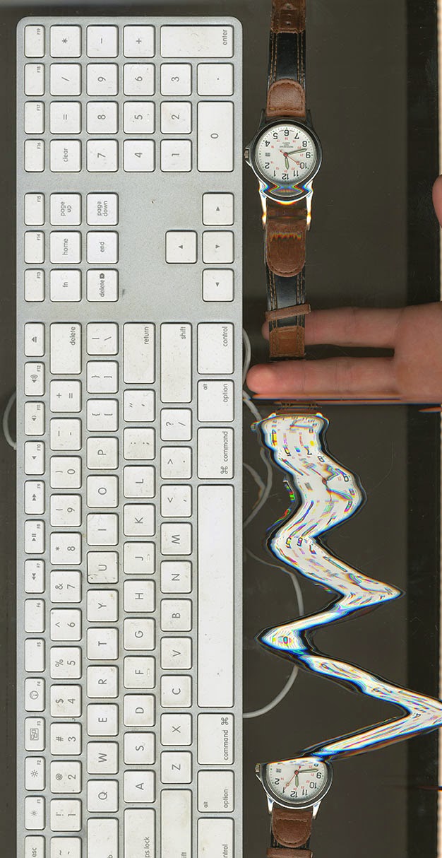
Space GIF


Technology log

I started my 24 hour technology log 12am Monday morning when I went to sleep.
5:30am- wake up from alarm on phone, sit up look at my phone (10 min)
6:00am-8:00am (wall ball test, listened to music the whole time, and looked at my phone when I changed songs)
8:05am-8:10am checked my emails
8:10am-8:30am get changed go to breakfast
8:30am-9:10am ate breakfast looked at my phone once every ten
9:10am-10:30am go to class and look at projections for 30 minutes
10:40am - 12:00pm go to class and use laptop and phone the whole time
12:00pm-12:30pm go to arc to stretch and play wall ball. looked at phone to check time on it. (4 min)
Drove car to lunch (5 min)
1:49 pm-wake up from weird timed alarm I set. Look at phone for (5 min)
2:00pm-2:30pm: listened to music while in the arc (30 min)
3:00pm-5:15pm practice
Drove to class (5min)
6:00pm-7:00 pm did homework on laptop
Drove back(5min)
9:20pm-9:30pm Talked on the phone (10 min)
10:30pm-12:00am homework on laptop


 I averaged out how much I use my phone and figured I used it about 2 hours extra out of the day. It's crazy how much I use technology throughout my day. Doing this made me realize how reliant we are on technology. It's become a part of who we are as a modern society and we're so unconscious to how much we rely on it and how much technology runs our lives.


Thursday, January 22, 2015

First reading

2KdoddleFourteen
The artist I chose was Charles Csuri, a traditional painter who latter turned to digital art.  I was interested in his work for how he described digital art.  He related the way he works in different mediums as learning a new language. When he was a painter the language was smooth or harsh brush strokes to depict a certain emotion.  In digital art the language was the logical code that he used to make his pieces.  He said that it took time to learn the language of digital art and questioned weather what he did had the same effect on an audience as it did when he was a painter.  His digital art is expressive but he questions what is so expressive about it when the process of making it is so mathematical and logical.  I found it very interesting how he described the process of making his art.  At first you must learn the "language" of digital art and then you'll be able to form the creative ideas from the logical coding part of digital media.  

digital art

Being a computer science major I have to learn many different languages to code in.  Every semester that I have been here I have have had to code in one or multiple different languages. When I have a big project I'm working on the only thing that I think about after I'm finishied working on a part of the project is how I will code the next section.  I start thinking in whatever language that I'm coding unconsciously until I figure out a possible solution to the next part of my problem.  I think that what Csuri said about thinking in whatever medium one is working in is completely true.  His work is fascinating because being able to code something and make it turn out into one of these abstract pieces takes a vast amount of knowledge about coding.  Being able to think in a mathematical frame of mind to produce these beautiful works is beyond anything that I could ever think about doing.   

digital art

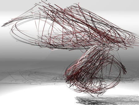
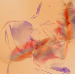
The piece I liked the most was the first one because it is so abstract.  The way he used thin lines to form the same repetitive shape made his piece look three dimensional and add depth to the piece.  The way it the top piece shrinks down to the smaller bottom piece makes it look possible that it could be floating.  There is a lot going on with all of the lines intertwining yet the piece looks like its weightless hovering in the air.  It makes you question why its floating, The shadows it creates are just as interesting as the piece itself.  If you look at the piece and try to follow one line as far as you can you get lost inside the piece because there is so much depth to it.  The only thing I might change in his work is to add contrasting colors to the piece so that you could see each little individual shape that each line makes.  There's not much that I would want to fix on this piece because I like it so much.  It's so intricate and knowing that he thought about and played with the coding of this piece to form the final result is what interested me most about it.

http://www.csurivision.com/index.php/2012/02/tactile-kinesthesis/#more-478